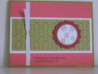
Kind of a crappy picture eh? It's the pink, the pink, it's too light. It's Pink Pirouette, one of SU's new "in" colours, I am not a big fan of it that's way I choose to work with it for this card because I don't really care for it, it's too light.
Isn't this card awesome? I have seen alot of them but never knew how to do it. I stumbled, as always across the tutorial in one of my blog search sessions. The template for it can be found here. I tweaked it a bit myself. I just love, love, love them, the baby onesies I mean.
All supplies SU except for buttons.
Pink Pirouette for the onesie, whisper white for the scallops and 2 white buttons.


